Finance screenshots that explain what the numbers mean
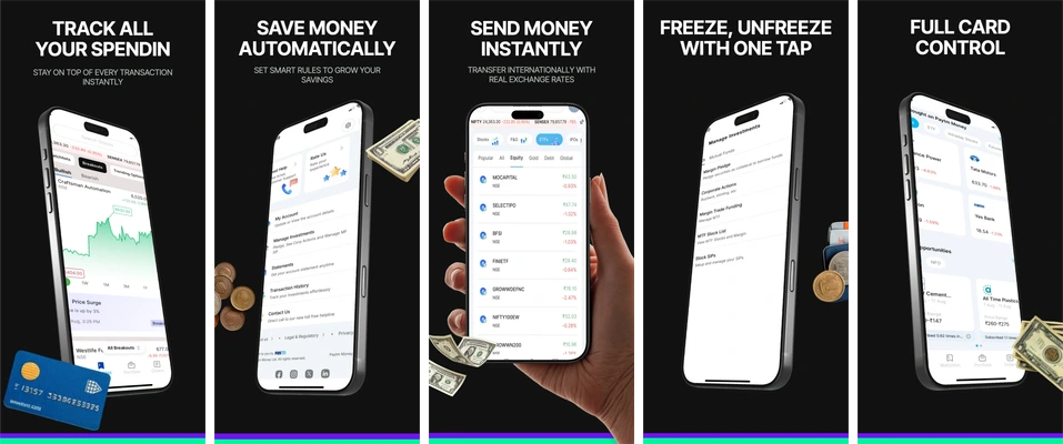
A breakdown of Spending and Cards from the existing template catalog. The sample sequence covers spending, saving, transfers and card controls; its figures are not customer or investment results.
1. Give the first amount a clear meaning
The opening composition offers an overview before introducing more detail. In your app capture, a prominent number should have an explicit label: available balance, planned budget and money spent are different concepts. Include the currency and relevant period in the actual UI when they are needed to interpret the value.
Use a dedicated demo account with coherent fictional amounts. A large positive balance can attract attention while explaining very little. The screenshot should show the product’s function, not imply that using it creates that balance.
2. Make the spending view answer one question
The opening spending view needs context. Choose whether the image explains categories, a time period or an individual transaction; showing all three at equal weight can make the screen hard to read. A short headline such as “See spending by category” is useful only when that breakdown is visible.
Keep axis labels, category names and legends legible. Do not remove context from a chart to make the result seem more dramatic. If the real app uses a different chart, import that screen intact instead of redrawing a more favorable one in the surrounding design.
3. Distinguish a saving control from a result
The saving composition describes an automated action. Show the actual rule or control that makes it work. A savings balance does not demonstrate that a user achieved a financial goal; label demo values and explain the available feature.
| Proposed copy | What would support it | Editorial decision |
|---|---|---|
| See spending by category | A visible category breakdown in the released app | Use when the capture actually shows it |
| Set a monthly savings goal | A working goal-setting feature | Describe the feature without promising achievement |
| Save twice as much | Reliable outcome evidence for that exact claim | Do not infer it from an illustrative dashboard |
4. End with a specific next action
The closing compositions show card actions and controls. Explain the actual action, such as freezing a card or opening its settings. Adapt it to what your app actually does. Keep security, certification, partner and performance claims out of the artwork unless you can substantiate the exact wording and use any associated marks with permission.
Prepare the real app version
- Capture your own app with fictional, internally consistent demo data.
- Replace the sample image as one asset. Edit the surrounding text, colors and placement separately.
- Review amounts, periods, currencies, charts and headline claims together.
- Export the available boards and inspect them at full resolution and phone-preview size.
This is design guidance for presenting an app interface, not financial advice or a compliance review. The release checklist covers file and content review; the localization guide covers language and regional presentation.