App Store screenshot design: build a clear visual story
Design a readable app screenshot set: choose the first screen, plan the sequence, balance headlines and UI, adapt a real template and review each export.
How do you design a clear App Store screenshot set?
Lead with a real app screen that explains the main experience. Give each screenshot one distinct job, use a readable headline and keep the interface prominent. Repeat a small set of colors and type styles, then inspect every exported image at listing size and full size. Adapt the design for each store and language, and check the files against the intended upload slot.
Store reference: Apple product page guidance; Google Play preview asset guidance.
See the sources and evidence below for this guide's documentation and recorded observations.
A screenshot set has two jobs: help someone understand what the app does and show the interface that delivers it. Start with the app's real screens, then use layout, type and color to make one useful idea clear in each image. This guide covers visual decisions; use the separate size guides for the exact store upload requirements.
Start with the first useful app moment
Choose a screen that shows the central action or result of using your app. A task app might lead with today's usable task list; a language app might show an actual practice exercise. An empty onboarding screen, a logo or a settings menu usually gives a new visitor less information. If an app starts empty, prepare realistic demo content in the release build before capturing it.
Apple explains that the first one to three screenshots can appear in search results when no app preview is available, depending on orientation. Make that opening group understandable without relying on the rest of the carousel. This is a reason to prioritize the main experience, not evidence that any particular composition will increase downloads.
Give each screenshot a different job
Write a one-line purpose for every board before arranging the artwork. The following is a hypothetical reading-app brief, not a claim about the app shown in the catalog preview. Use only the rows supported by your released app, and choose the final screenshot count for your store and release needs.
| Board | Question it answers | Capture to show |
|---|---|---|
| 1. Main experience | What can I do here? | A real reading or discovery view with recognizable content. |
| 2. Useful action | How do I find something I want? | The search or browse flow, if it exists. |
| 3. Saved result | Can I return to it later? | A populated saved list or collection. |
| 4. Differentiator | What else matters to me? | An actual annotation, accessibility or organization feature. |
| 5. Repeat use | How does this fit my routine? | A relevant progress or recent-activity screen, without invented outcomes. |
Build a hierarchy: headline, app screen, supporting detail
Decide which element should be noticed first. A short headline can explain the purpose of a busy screen; a distinctive interface can lead with a smaller caption. Avoid giving the headline, device frame, decoration and secondary label equal visual weight. Remove an element if it does not help explain the screen.
Start with one type family and a small set of type sizes. Keep the main message readable when the exported image is reduced to the approximate size of a store listing on your phone. There is no universal headline font size: the canvas, typeface, line length and surrounding artwork change the result. Test the image you actually plan to upload.
Give the headline enough contrast against its immediate background. A pale word over a pale photograph may be readable in the editor at full zoom and disappear in a smaller preview. Try a simpler background, a different position or a shorter line before making everything larger.
Read a real template before adapting it
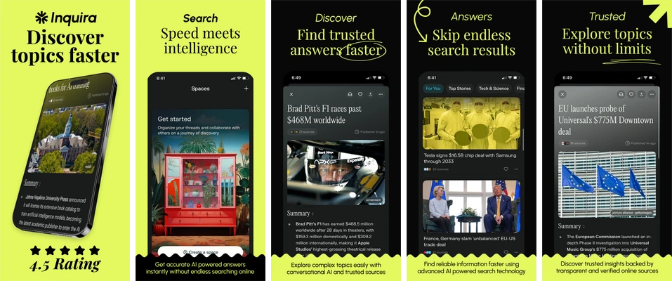
The Discover Topics template above alternates lime and black backgrounds across five boards. Its first board uses a large two-line topic headline and a tilted phone; later boards use more upright screens. Repeated colors, type and bottom-edge shapes make the set feel connected even as the content changes.
The same preview also exposes decisions you must revisit. Small interface text loses prominence inside the tilted first phone. Several secondary labels compete with the main message. The sample rating beneath the first device is template artwork, not a verified result for your app. Remove that rating and other unsupported claims before publishing.
Open the exact template linked above, replace its sample app captures, and change the headings to your own sequence. Keep the existing canvas while exploring hierarchy. If a frame or decorative detail makes your real UI too small, simplify the composition rather than hiding an important part of the app.
Choose a layout for the content you have
Keep app captures proportional. Enlarging a small source image can make UI text soft; stretching it to fit a canvas changes the interface. Use a sufficiently detailed capture and change the surrounding layout instead. A decorative device frame is optional and does not set the store's required output dimensions.
| Layout | Useful when | Review before export |
|---|---|---|
| Large UI with a short caption | The interface already shows a clear action or result. | The capture remains sharp and important controls are visible. |
| Headline above an upright screen | A little context helps explain the interface. | The headline does not shrink the app screen beyond readability. |
| Angled device with supporting artwork | Depth or a visual theme helps explain the feature. | Perspective, cropping and decoration do not obscure the experience. |
| Connected panoramic sequence | Several screens share a visual story. | Every board still works alone and text does not depend on a neighboring image. |
Adapt the composition for each store and language
Prepare separate Apple and Google Play versions. Google's screenshot guidance prioritizes actual UI in the first three images, recommends using taglines only where they add necessary context, and advises against device imagery. A prominent phone-frame design is therefore a starting point to review, not a universal fit for both stores.
For Google Play, check the linked guidance on promotional claims, testimonials and install calls to action before reusing sample copy. Add useful screenshot alt text in Play Console. These content considerations are separate from whether the image passes file dimensions and format checks.
For each locale, replace both the app capture and surrounding wording where appropriate. A translation may need extra lines, a different line break or right-to-left layout. Review the complete localized image with someone who understands that language; shrinking every headline to fit the original box can erase the hierarchy you designed.
Review the exported set in two passes
If you want to compare two designs, write down the specific change and the outcome you intend to measure before running a store listing experiment. A visual preference, a template preview or a before-and-after screenshot does not by itself establish a conversion improvement.
- At listing size, check the opening message, reading order and whether each board adds new information. View images individually as well as in sequence.
- At full size, inspect capture sharpness, clipped words, distorted UI, sample branding and any personal information in demo data.
- Measure the exported dimensions and format with the screenshot checker, then compare them with the intended device slot. A correct design canvas does not replace checking the downloaded file.
- Preview the uploaded images in the relevant store console. Record the app build, locale, screenshot order and approved files so the next release can repeat the review.
Sources and related guides
Linked sources reviewed October 26, 2026. The workflow advice is Skir’s editorial guidance; it does not certify a particular app or predict conversion results.